Wednesday, 8 January 2014

Media Regulation - Classification


In order to understand film classification decisions and the role of the BBFC (British Board of Film Classification) better, I looked at 3 films of different genres and thought about why the film was given the certificate that it already has, and if & why I would change the certificate. The first film I looked at was Nightmare On Elm Street (2010), which is an 18 certificate. It is easy to see why this film is an 18, as it shows a lot of gory violence and has deeply disturbing psychological horror themes. In the case of this film, I wouldn't change the certificate as I think it fits the content of the film well.


The next film I looked at was Girl, Interrupted (1999), which is a 15 certificate. This film revolves mainly around adult themes such as suicide, although to a younger audience this may not be obvious. There are a few scenes which make it obvious why this film has a 15 certificate, though these scenes are short and could easily be cut out if the film was marketed towards a younger audience. However I think that considering the film generally would appeal to an older and more mature audience, the certificate is fitting.

Winona Ryder and Angelina Jolie in Girl, Interrupted

The last film I looked at was Heathers, which was given an 18 certificate in the UK and and R certificate in the USA. I disagree with this rating: although the film does display adult themes such as teenage murderers and suicide, it is definitely not scary or shocking enough to warrant an R rating, as the film generally gives the 'scarier' moments a satirical edge. Heathers definitely should not have been given an older age rating than Girl, Interrupted, however I think that the reason Girl, Interrupted was a 15 and Heathers was given an 18 certificate could be because of the 11 years between their release. I would have given this film a 15 certificate rather than an 18, because of the reasons I listed above, and the fact that recently with the rise of the internet and easier access to films, Heathers has become incredibly popular with a younger teenage audience, and so in marketing this to 18+ year olds, the distributors missed out on a huge demographic.


Winona Ryder in Heathers (above) and the IMDB Parents' Guide page for Heathers (below)


Promotion Progress

Recently we have been focusing more on the online promotion of our artist. We have each focused on different ways of promoting him: I am currently working on Adash's Facebook page, and Rachael is working on the Wix page, which we're using as his official website. The cover photo on the Facebook page (pictured below) is currently set as a collage that Adash/Adam created himself. As Adam is an artist and creates 2D work that can be used digitally, we are considering promoting Adash as a graphic artist as well as a musician, and creating a page on his website dedicated to his art.


Artist Photoshoot


The following photos were taken as promotional artist shots of Adash for us to use on the artists' website and digipak. We projected a short edited film of jellyfish onto him and took photographs as it played, which made it less predictable how the photos would turn out. However I think they turned out well, and we can definitely use these photos to promote Adash in the way we intended.


Saturday, 30 November 2013

Ancillary Task 2: Further Digipak Research

Celebrity Skin - Hole


This digipak is more conventional than the Sonic Youth album, as it uses full-page photographs rather than collage, and typed text instead of handwritten text, but the use of off-centre photographs & the painting on the back give it a less conventional and more quirky feel. I don't like the design of this digipak as much as the Sonic Youth digipak as it seems too traditional and dull, however I like the use of full page photographs and I think we could use a similar style in creating our own digipak, but possibly overlay it with collage, hand-written text, or drawings.


BACK                                                                   FRONT


BOOKLET                                                              DISK


DISK


BOOKLET (background is plain black, rainbow effect is scanning error)


Ancillary Task 2: Further Digipak Research

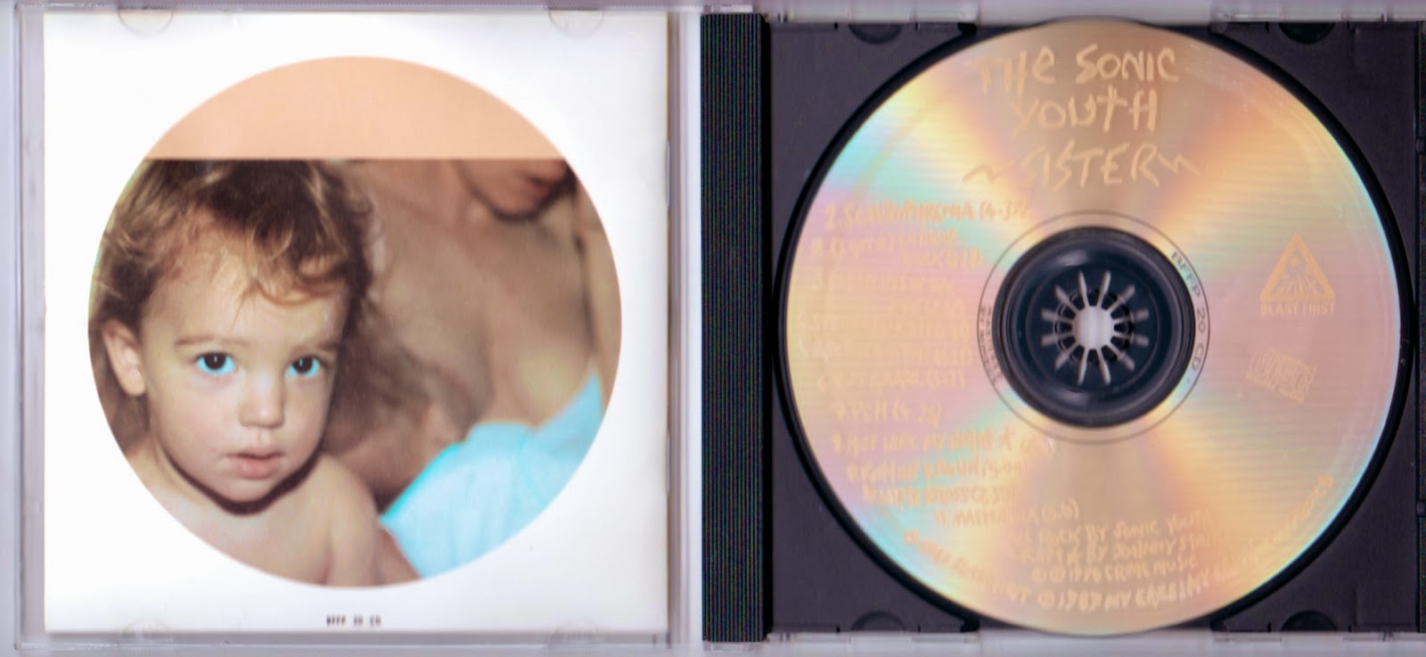
Sister - Sonic Youth

This album by 90s alternative noise rock band Sonic Youth uses an unusually artistic scrapbook-style approach to this album, using collage and handwritten lyrics rather than the more conventional photographs and type-written text. I like this digipak because of the way the artistic style of it makes it feel more informal and personal. I find the way the disk is printed inspirational in the approach to creating our own digipak, as I think using handwritten text is a good way to make an audience feel closer to the artist.


BACK                                                                    FRONT


DISK


BOOKLET                                                                      DISK


BOOKLET


Ancillary Tasks: Ideas

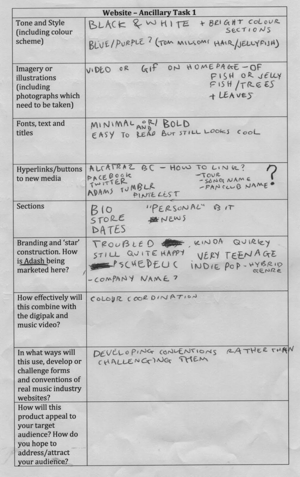
In addition to editing the video, this week we started more intense research into the ancillary tasks, creating a website and a digipak to promote our artist. To make our ideas more clear and linear, we wrote them out into graphs for each task. We drew from the content of the music video, as well as inspiration from already established artists' websites to create initial ideas for what the website and digipak are going to look like. Katie and Rachael, the other members of the media class, looked at other artists' websites such as Radiohead (link) and David Bowie (link).


Editing Progress

This week we started looking at the ancillary tasks, creating a digipak and website to promote our artist, and so editing temporarily became a secondary task. In order to make what we had to do clearer, I wrote a list of all the problems in the music video so far so we could fix them after further research into the ancillary tasks. So far the first 5 problems have been resolved in a single period of media, and so I don't think the rest of the list will take too long to complete.